
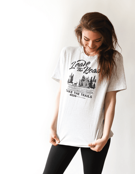
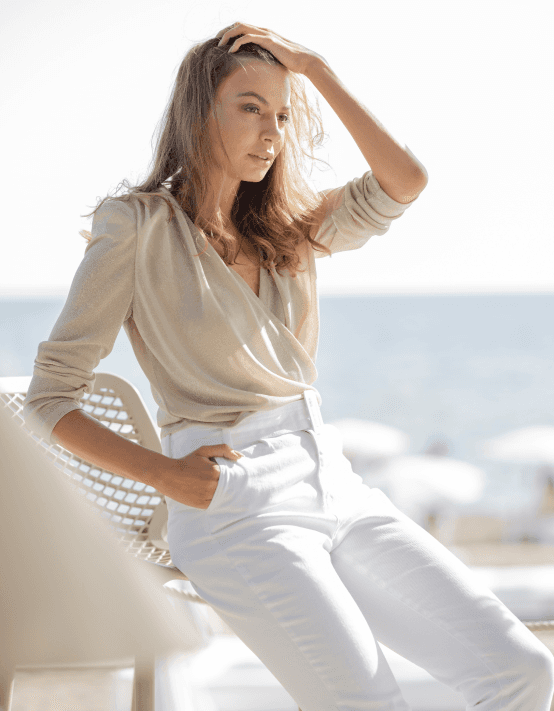
How I helped
In the creation of the Fashionify project, I was privileged to play a pivotal role in shaping a unique web design experience that resonated with both aesthetics and functionality. My involvement was not merely about coding and design but understanding the client's vision and end-users' needs. Collaborating closely with the client, we began by conducting comprehensive market research to identify gaps and opportunities in the client's industry. This research-driven approach paved the way for the creation of a web design that not only looked stunning but also addressed the pain points of the target audience.

Intuitive Design
To get a playful and friendly message across, I went for a sans-serif (meaning non-curly) font. In this case, we used Inter. Inter is a very popular font, and it's considered great by a lot of designers. Inter is a popular and highly regarded font, and several factors contribute to its reputation as a good font:
Readability: Inter is designed with readability in mind. Its letterforms are clear and well-proportioned, making it easy to read both in print and on screens. This makes it a suitable choice for a wide range of applications, including websites, apps, and printed materials.
Versatility: Inter is a versatile font family that includes multiple weights and styles (such as regular, italic, bold, etc.). This versatility allows designers to use it in various contexts and create visually appealing designs with a consistent typographic look.
Open Source: Inter is an open-source font, which means it can be freely used, modified, and distributed. This makes it accessible to a wide range of designers and developers, promoting its widespread adoption.
Modern Design: Inter has a contemporary and clean design that aligns well with modern design trends. Its design includes a balance between curved and straight elements, resulting in a pleasant and balanced visual appearance.
We also went with the color blue. The color blue carries various meanings and associations in design, and its interpretation can vary depending on cultural and contextual factors. Here are some common messages and emotions associated with the color blue in design:
Calmness and Tranquility: Blue is often seen as a calming and soothing color. It can create a sense of serenity and relaxation, making it suitable for designs related to wellness, meditation, or stress relief.
Trust and Dependability: Blue is frequently associated with trustworthiness and dependability. It is often used in corporate branding to convey professionalism, reliability, and a sense of responsibility.

Conclusion
In conclusion, our Fashionify app web design project has been an exciting journey of creativity and innovation. We embarked on this project with a clear goal in mind: to create a visually captivating and highly functional web interface that mirrors the elegance and style of the Fashionify brand.
Throughout the project, our team meticulously designed and developed a website that not only showcases the latest fashion trends but also offers a seamless and enjoyable browsing experience for users. We paid close attention to user interface design, ensuring that it is intuitive and easy to navigate, making fashion discovery effortless.
By incorporating responsive design principles, we have made Fashionify accessible to users across various devices and screen sizes, ensuring that everyone can enjoy the world of fashion at their fingertips. We've also implemented robust security measures to protect user data and provide a secure online shopping experience.